September 5, 2014, 8:43 am
Inside pages of the Danish comic book below.
↧
September 8, 2014, 11:43 am
Artwork for the Italian "Goldfinger" posters attributed to Averardo Ciriello. Original version from 1964 on the left, reissue on the right. Although they are similar the reissue poster was re-painted. Does anyone know why?
↧
↧
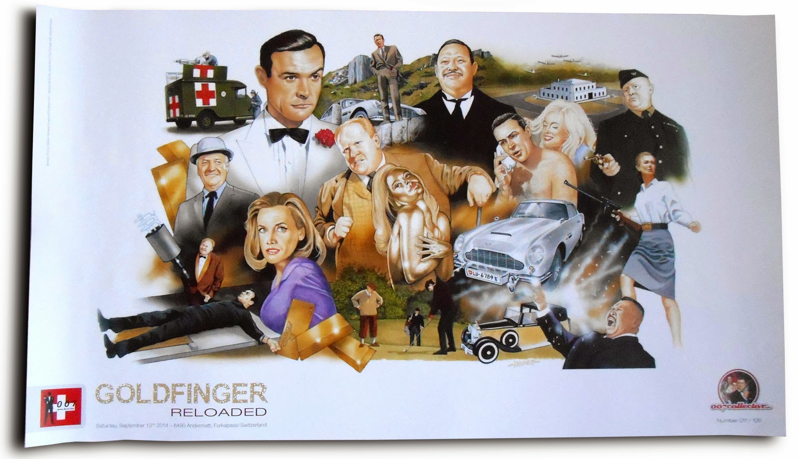
September 19, 2014, 10:05 am
Poster for the 50th Anniversary event "Goldfinger Reloaded" in Andermatt, Switzerland. Artwork by Graham Kennedy.Big thanks to the Swiss Bond Club for this great event and especially to Michael Hackl, the 007 Collector.
↧
September 20, 2014, 12:45 am
While actress and artist Margaret Nolan has starred in more than 50 film and TV roles, 007 fans probably know her best from her role as the Dink in "Goldfinger". But she also features in the iconic title sequence and poster campaign for Goldfinger designed by Robert Brownjohn. Margaret was so kind to answer my questions about her involvement: Illustrated 007: How did you get involved in the title and poster production for the film Goldfinger? Margaret Nolan: I was asked to do the titles and agreed on condition I had a part in the film. What kind of briefing did you receive? Only that I was required to wear a bikini and be painted gold. Was the title song available for the session as a reference or was it filmed in silence?Brownjohn had his jazz going
Where was the sequence filmed and how long did it take? At his studio. I think it was Fulham. It took a week, at least. I can't remember exactly. You appear very calm and collected in the title sequence but I could imagine that it took a lot of effort. How did the shoot go? It was no effort at all, just very tiring. Being painted every day took some time, an hour at least and then all washed off after. Robert Brownjohn is described as very talented but also challenging to work with. What was your experience? No, he was totally professional Was the photo used in the Goldfinger poster shot separately or was it all done in one go? It was done at the same time. There was a photographer (Herbert Spencer) there all the time.Nowadays you create your own artwork. What inspired you to do them? Having all these photos from my career and not knowing what to do with them as they were too good to throw away.Thank you Margaret! Her artwork can be found at margaretnolan.co.uk
↧
September 20, 2014, 10:35 am
US Lobby card set of 8 for "Diamonds Are Forever"There are 2 different sets, it appears that one is for the US market with NSS text and Broccoli mentioned in the producers credit first while the other set mentions Saltzman first. Mini Lobby Card set of 8 which also exits in 2 variations.Reissue set of 5 cards (?) for the 1984 MGM re-release.
↧
↧
September 27, 2014, 2:21 am
Update for the US "Diamonds Are Forever" Lobby Cards: There are 3 different variations of the cards which differ in the producers credit and the white strip at the bottom. I've read somewhere that the cards were re-released in the 80s but I have no idea which is which.
Thanks to Simon for sharing the third card and his knowledge with me!
↧
September 28, 2014, 1:23 am
Cover artwork for the first Danish comic edition of "Agent 007 James Bond - Højt spil i Monte Carlo" (Casino Royale?) from 1965.
↧
October 1, 2014, 10:33 am
"From Russia With Love" lobby cards were printed in black and white and then tinted to give it a red tinge. Various reasons for this have been offered but the most oft recurring one was that those responsible for the marketing wanted to push the political “red-ness” of the film. This would appear to be a credible reason as both the US 1 Sheet posters for the film also followed the black, white and red colour scheme. While the lobby images are generous in size, it nonetheless remains the least obviously glamorous of the series. However, perhaps due to what may later be seen as various printers sharing the duties to produce the marketing material, there are in fact two slightly differing sets of FRWL cards. The sets differ both by the tint and a slight juxtaposition of card numbering of the first five cards. One set is purple-tinted and the other set is rose-tinted. Again, only the first five cards are numbered differently -- cards #6, #7 and #8 feature the same photos in both sets. For example, Bond in bed was printed as Nos. 3 and 4, the Helicopter chase was printed as Nos. 2 and 3. Thanks to Simon for sharing his lobby cards and the information above about the cards!
↧
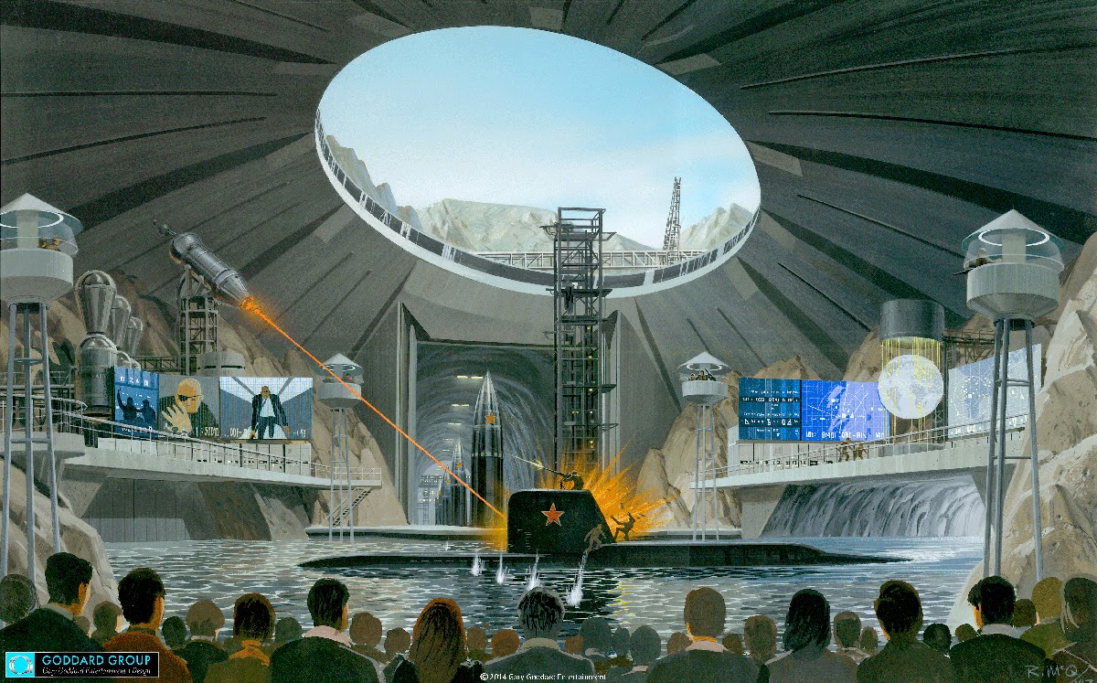
1987 artwork by Ralph MacQuarrie for a planned Universal Studios Attraction. More info about the artwork here.
↧
↧
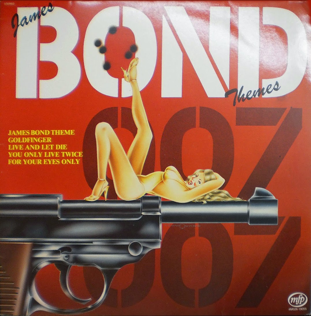
October 10, 2014, 10:03 am
"James Bond Themes" record cover, MFP 4M026-19055
↧
October 11, 2014, 8:18 am
In April 1956 the British newspaper Daily Express serialised Ian Fleming's novel "Diamonds Are Forever" The text was illustrated by the artist Robb.
↧
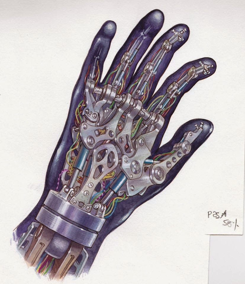
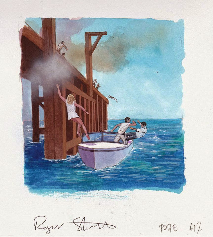
October 19, 2014, 7:47 am
![]()
![]() Original illustration for "Dr No" from the Dorling Kindersley book "The Secret World of 007" illustrated by Roger Stewart.Thanks to Thomas from The Nixdorf Collection for sharing these.
Original illustration for "Dr No" from the Dorling Kindersley book "The Secret World of 007" illustrated by Roger Stewart.Thanks to Thomas from The Nixdorf Collection for sharing these.
↧
October 21, 2014, 12:23 pm
Original artwork for the German campaign of "Sag Niemals Nie" (Never Say Never Again). Illustration by Renato Casaro.
↧
↧
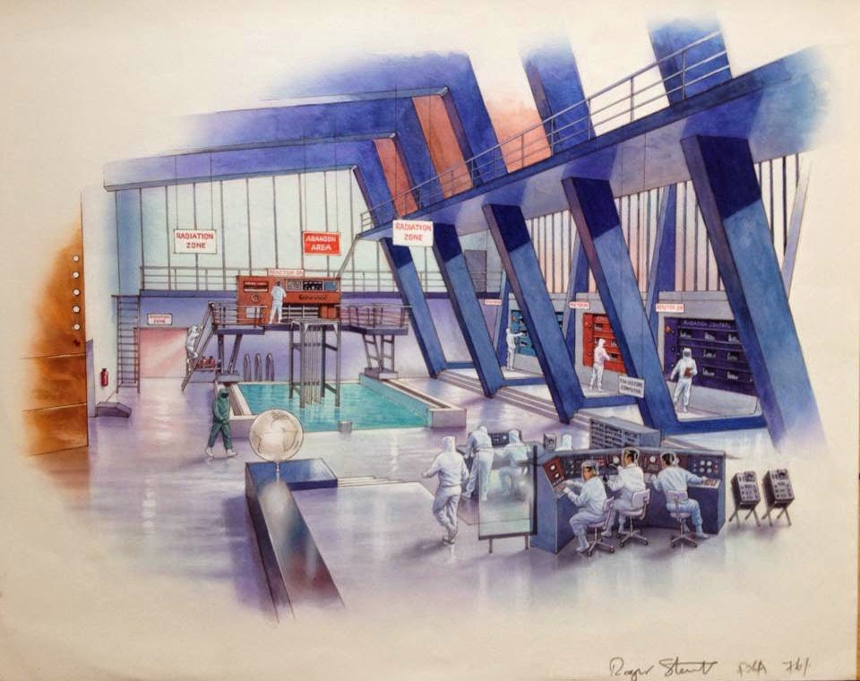
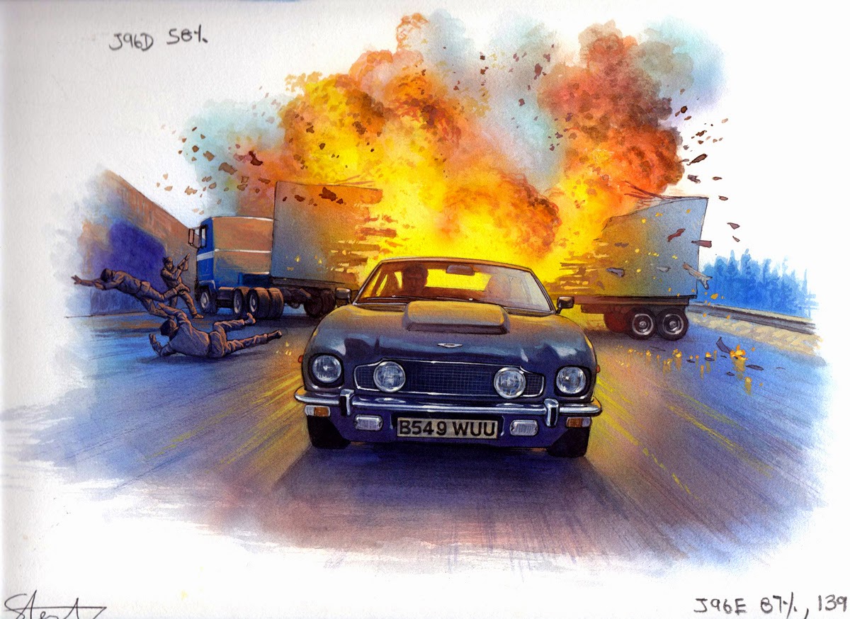
October 25, 2014, 6:29 am
Original illustration for "The Living Daylights" from the Dorling Kindersley book "The Secret World of 007" illustrated by Roger Stewart.Thanks to Thomas from The Nixdorf Collection for sharing these.
↧
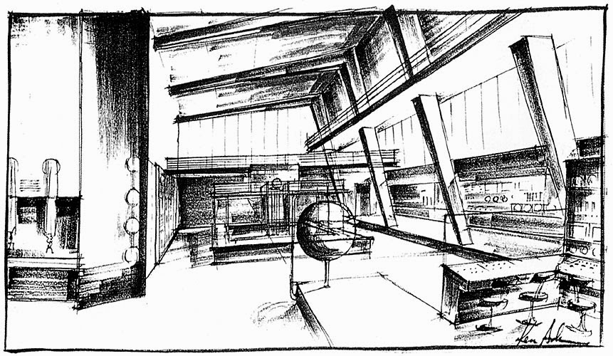
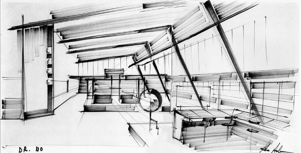
October 26, 2014, 11:45 am
Concept studies and design for the lab in "Dr No", artwork by Ken Adam.
↧
November 8, 2014, 8:59 am
"On Her Majesty's Secret Service": Comparison of the original artwork by Yves Thos (right) and the repainted version attributed to Otello Mauro - Maro - Innocenti (left) for the Italian advance poster campaign. I always thought that the poster used the original figure by Thos with just the ski mask added but the whole figure is repainted.Check the glass for example.
↧
November 9, 2014, 1:46 am
Artwork for the MGM VHS and laser videodisc release of "You Only Live Twice". Illustration by Michael Elins.
↧
↧
November 12, 2014, 7:10 am
Advance poster artwork for "The Living Daylights" used in several countries. Note the different dress transparencies...This artwork marks the transition from painted artwork to photo based movie advertising quite nicely.
Does anyone know the artist of this artwork?
↧
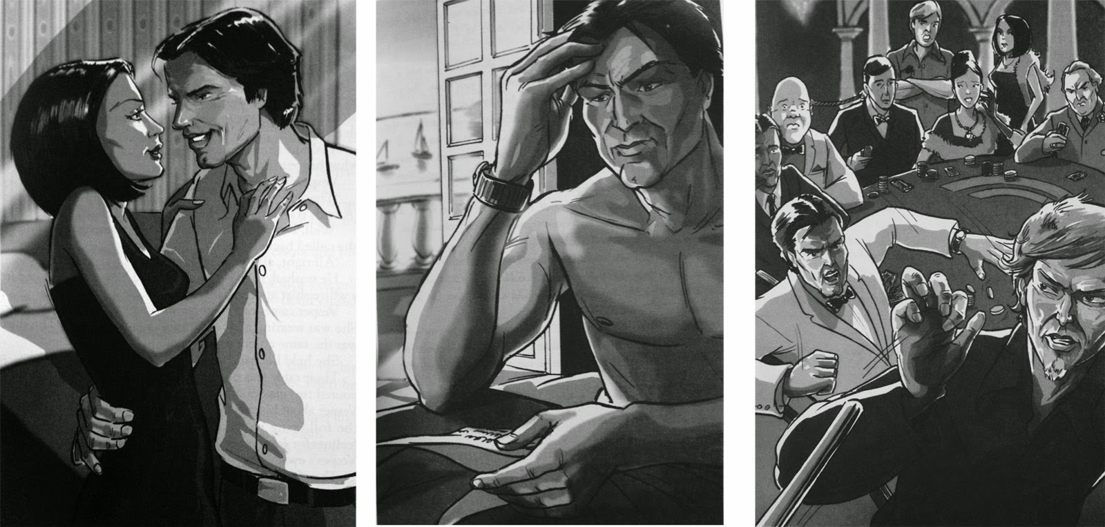
November 14, 2014, 9:57 am
Illustrations from the Macmillan Reader version of "Casino Royale" which consisted of an abbreviated version of Fleming's novel and 2 audio CDs. Thanks to Dan for sharing these!
↧
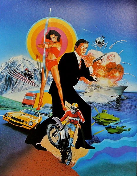
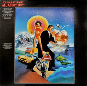
November 21, 2014, 6:24 am
![]() Cover artwork for the Japnese LP "For Your Eyes Only" by All About LP Vinyl 20AP-2092. Thanks to Anagnostis for finding this!
Cover artwork for the Japnese LP "For Your Eyes Only" by All About LP Vinyl 20AP-2092. Thanks to Anagnostis for finding this!
↧